Posts

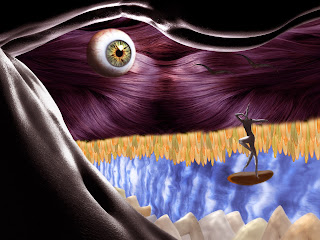
Living Landscape

Image
When this assignment was brought to us, I was very skeptical. I had no idea what I wanted to do. However I knew I desired a night scene, so I just started adding, duplicating, and altering. I worked with body curves, hair, tongues, arms, ears, and muscle cells. I felt I needed to get the light and shadow correct, so I spent a lot of time on that too. It turned out very cool and looks sort of real!

Colorization

Image
I found this project pretty interesting. Making a black and white photo have realistic colors in it was a challenge, but also pleasurable. I wanted to keep the photo balanced with certain colors on opposite sides of the picture to complement each other. I also wanted to keep the colors neutral as if the setting was a big city like Boston or New York. I felt the need to add some nature and greenery to the picture because it seemed too industrial to me. So I created tall hedges/trees in the distance. In general this was a cool project to learn from.

Cut & Paste

Image
This project was like our introduction to Photoshop to understand how it works. I've worked with cutting and pasting before so I knew a little about it, but I loved learning the easier ways to do it. I decided to stick with animals and flowers for my piece to keep a pattern, as well as some unity. However, I incorporated a bust of Sam Smith, my favorite artist, in the center of my collage. All the images I selected have a stronger meaning to me. For example, the purple lily is a symbol of Florence, Italy, where I studied a year ago. I enjoyed picking things at random that had to do with me and then pasting them in a collage together.

My Self Portrait

Image
I consider my Self Portrait Project to be my most successful one. I had to decide what clothes I was going to wear and what background I wanted to use. I wore a plaid shirt because I knew it would be complicated, but I wanted to challenge myself. I choose to create my own background as a graffiti/splatter painted look with two of my favorite colors that match my skin tone. Using Adobe Illustrator, I picked to mostly use the blab brush to pigment my skin. I then utilized all the different paintbrushes to get the curly texture of my hair down. Overall, this project made me realize I definitely have some green going on within my face and I'm amazed at what this software can do.

My Calligram

Image
I was most excited for this Calligram Project, but it was hard. I had to go home due to a family emergency for a few days so I never got to complete this one. I wanted to do it very realistic. I started off with the face, matching my skin tone, I constantly would check to see how it looked without the image there, to see if I was covering as much as I thought. The font I picked was sort of medieval in a sense.  I went back to each individual letter to alter it and make it larger and wider. I will definitely attempt to finish this on my own time since I think it would be really cool.

Character/Logo Exercise

Image
Apparently the character I choose was pretty elaborate, but I decided to stick with it. Basically we had our characters and created numerous layers matching the color and shape with paint on top of it. I never took a look at these characters or logos so much to see how much detail there really was. Working with the shadows I think was my favorite, because they were so unrealistic and you had no idea where they would go until you looked back onto the picture. Overall, I enjoyed this one a lot!

Canvas Lanscape

Image
This project I was excited for, I thought it was the coolest thing. We had to create a house, a creature, a flower, a cloud, and a sun on Dreamweaver. This was much more complicated than the last project. I started the cloud first because I figured that would be the hardest, the flower was more difficult.  I wanted to keep my landscape peaceful so I made the background a sunset, rather than a clear blue sky. I also created a large ant for my creature, which I thought was cool because it was very unproportional to the house just like the flower was. My idea was to make it an unrealistic world, where the house and the people were tiny living beneath the bugs and trees.